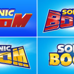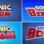
Back on December 14th we reported that Senior Designer Henry Grey shared alternate logos for Sonic Boom on his page at Creativepool, and now today our own Shadzter once again has found that Henry has shared even more over at Cargo Collective which you can see above.
Which logo do you find interesting? Any you prefer to the final one? Let us know in the comments!
The Sonic Stadium may link to retailers and earn a small commission on purchases made from users who click those links. These links will only appear in articles related to the product, in an unobtrusive manner, and do not influence our editorial decisions in any way.

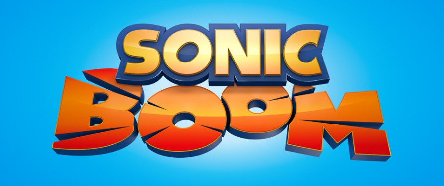
The Sonic Stadium has uncovered alternative designs for Sonic Boom’s logo that were scrapped in favour of the above final product we have now. The images were found on Senior Designer Henry Gray’s page at Creativepool where he describes Sonic Boom as “A grown up, adaptable and animated identity for the largest franchise from the Sonic stable to date”. You can check out the designs below.
Source: Creativepool
Do you think SEGA should have gone with one of the other logos, or do you like the one we have? Speak out in the comments!
The Sonic Stadium may link to retailers and earn a small commission on purchases made from users who click those links. These links will only appear in articles related to the product, in an unobtrusive manner, and do not influence our editorial decisions in any way.


