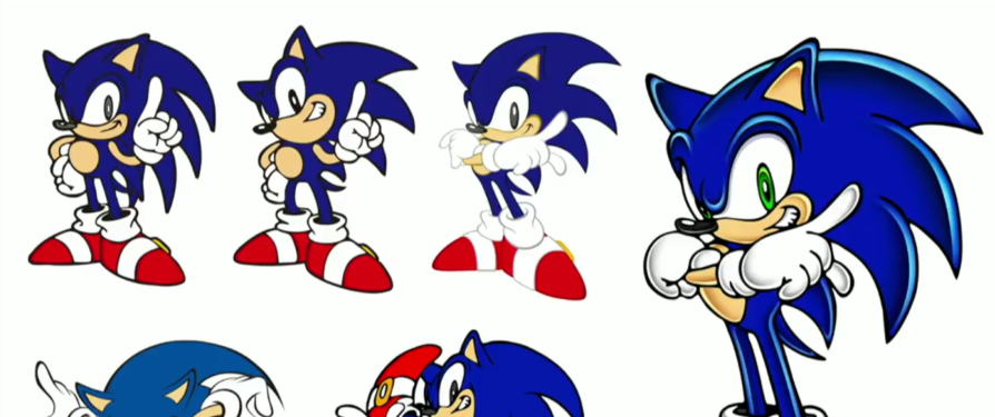
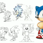
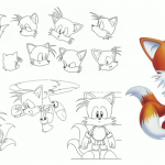
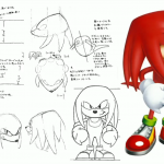
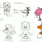
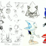
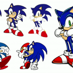
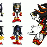
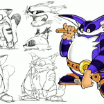
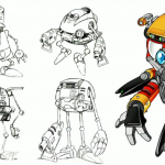
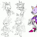
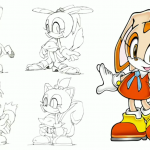
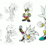
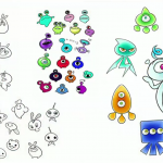
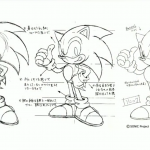
Sega have just held a Sonic event at Joypolis in Japan which we previously reported would be live-streamed (we do not yet have an archive of said live-stream yet). In the event, they have unveiled a couple of key things (the second of which is being posted about next), first is that they have unveiled a slew of sheets featuring many characters and their various stages of designs along with their final design.
Below is all of the sheets shown so far in the following order; Sonic, Tails, Knuckles, Amy, and Metal Sonic in the classic era, and as well as Sonic, Shadow, Big, E-102 Gamma, Blaze, Cream, Silver, and the Wisps from the Adventure era and onward, with an additional Adventure Sonic sheet to finish.
Via Rlan at NeoGAF

Guys, you’re missing Jet’s concept art.
Here’s where you can find Jet’s concept art, BTW.
https://youtu.be/7_0Smuksrqo?t=37m58s
Also, here’s a link to the stream so you can archive the video.
https://www.youtube.com/watch?v=7_0Smuksrqo
Great, new content there, especially seeing more sketches of classic Knuckles and Gamma looking more close to EggRobo in one sketch. It wasn’t until I start bursting out of laughter for seeing those alternative designs for Shadow.
There are some drawings we have already seen but some are completely new findings. Nice to see them as it traces how the characters were designed.
I like the older choices for Silver better. In particular, I think he looks better with his head quills slicked back a bit. The finished design looks more like a goofy concept art next to them. imo
oh wow, Shadow looked … very OC-ish back in his designs.
the Cream proto-types are just so adorable though, Sega could bring them back as their own characters.
Also more Metal Sonic concepts so im happy : )
Well by the looks of it, cream’s prototypes are a squirrel, a badger, a raccoon and kangaroo? They’ve already used two of those for new characters
I love looking at this kind of stuff.
I like a lot of the Wisp concepts, though the final designs are of course the best.
BIG LOOKS TERRIFYING…
Some interesting concepts to say the least.
The top left, top right, and bottom left concepts of Blaze are pretty cool. She seems a bit more foreign and tribal, like Rinkah from Fire Emblem Fates.
The Big concepts are all-around hilarious. The bottom right one makes me think of the old Sugar Crisp mascot.
The Shadow concepts are all-around creepier than the final, making him look more like a demon version of Sonic. I like the final design a lot better – you can’t believe that any of the other designs would be the Ultimate Lifeform created for the betterment of mankind.
Thorpe Cream concepts are so adorable! I would definitely like to see some of them revisited. I’d put a bet that Archie might steal a few of them for OCs.
Seeing Gamma look closer to an Eggrobo is weird. I know that even in the final his torso is somewhat egg-shaped, but it had more of its own identity.
Agreed about Blaze conept arts, hope they will use some of them for alternate costumes or alternate looks for her, perhaps in a game Blaze turns into a pirate and has to dress differently.
I love Gamma’s beta designs. So cartoony and egg-like. Just adorable. I really miss Gamma.
I remember reading in the Gamesmaster 20th anniversary special that before Tails became Tails, they had a turtle character named BOOMER who had a rocket powered jet or somthing on his shell to make him faster…..
Am I the only one who thinks that the upper two Shadow concepts look like recolored Knuckles with ears?
Also, the “second Adventure Sonic” is actually Sonic’s design from Sonic X (if you look very closely, you can see the Japanese name of TV Tokyo mentioned in the copyright note).
I like the early wisps design a bit more. The final design looks so generic unlike the third design that really looks like it belongs in the world of Sonic. That’s just my opinion.
So I’m guessing there were never any scrapped contents for Amy’s Adventure redesign? I’d also like to see more Boom Concept art for the other characters, like Tails, Knuckles, and Amy, because we’ve mostly seen just Sonic, Eggman, and Lyric concept designs.
they spend alot of work and processing the concept of this development.
Big looks like the cat bus from My Neighbor Totoro.
Really? I thought they based Big on Totoro himself.
Wow, those are so cool! Big’s concept art in particular was pretty darn interesting. He looked vicious!
Oh Lordy Lord! This is delicious!!!
They where gonna make Shadow even MORE of an edge lord?!! I thought Silver’s concept art was bad, but this is on a whole nother level: There where plans to give this dude a swollen eye, facial scar and a buff chest? And the other one is almost a prototype to Mephlis? Seriously, what the fuck was Iizuka smoking during that time? WHAT WAS EVERYONE SMOKING?! It’s designs like this that continues to show how SEGA was utterly obsessed with the concept of “cool”, that it turned out to be an obstacle.
Yeah, these designs where probably left overs from the most earliest prototype story synopsis from SA2, where Shadow was supposed to be a denizen of hell that escaped after a meteor threw upon a portal to the underworld. I remember reading that when the Resaurus action figure prototype leaked info about Shadow and Rouge (back in the olden days of the internet). To whoever was at SEGA during those time and disapproved of all this nonsense to give us the Shadow that I know and (un)love….thank you. You helped the franchise dodge a bullet….
You know what’s funny: for a while, young me thought Shadow was going to wind up being Metal Sonic with a flesh suit, and that last concept with the Zaku eye and the dreadlocks reminds me of those times.
Is Actual Hell Demon Shadow an actual thing?
Because that’s amazing in several ways and I’d like to see more.
TBH i’d love it if SEGA dug through all their concepts drawings and either threw them on the net or released a Sonic Concept Through The Ages book there must be 1000’s of awesome designs we’ve never seen, also that rabbit art is it me or is it the first time they’ve coloured it properly?
I’d also like to have seen the Panda character they had in mind too
I like pretty much all of the Blaze concepts so much, especially the bottom left and bottom middle look cool, she also seemed to have a more sassy or mean personality and she’s even wearing a skirt in some which doesn’t look especially princessy
I literally like Metal Sonic designs honestly he dosen’t look bad as I thought & also liking Metal Sonic final design a lot is my favorite of all time! Cream The Rabbit designs are adorable her final design is amazing! Modern Sonic designs from Classic Sonic beginning all the way to Modern Sonic then bam I like Modern Sonic final design a lot is my favorite of all time, to with Metal Sonic final design either! Both of Metal Sonic final design & Modern Sonic final design are my number one final favorite designs forever!!!
Not gonna like. I actually like the idea of Shadow only having one working eye.