
I say, this place does look rather fresh, doesn’t it? That’s no accident – this is the result of a looooong redesign process. It’s been a long time coming for a couple of reasons. The main one being that I’ve just been so busy with work, but also because there have been a lot of backend bits and bobs that have needed rejigging in order to make our long-in-tooth rebuilding process a reality. Yes, I know, I’ve said this loads of times before. But I mean it this time. Because… it’s June.
The Sonic Stadium has been truly lucky to have such a great team working behind it to get you the best Sonic news as and when it arrives. And now, they (as well as me, obviously) have the opportunity to quickly and efficiently get a whole heap of original written info and content back onto the site, without compromising our news reporting. You’ve probably already seen Jason’s great Archie comic reviews, or Hogfather’s impressive trips through obscure Sonic game features. Well, with this new design, we’re going to ramp up that quality long-form content for you.
It all starts with the new home page. We want our articles – the stuff that we have been spending more time on as of late – to stay on the front page and get exposure, long after they’ve been pushed off by a tonne of Sonic Lost World news. As we emphasise our video content and begin our journey to properly rebuilding our information section, you’ll find that we have dedicated space on the home page to these areas too.
At the moment, the entire site amounts to nothing but category lists right now. Except for the SSMB, of course. But in time, we will introduce new game, comic and cartoon info pages that won’t go old and mouldy within five minutes due to neglect. No! Neglect is not our middle name (anymore)! We kick neglect’s face into the dusty floor. Have it, neglect!
Ahem. The bottom line is, this new site design is just the first step in a number of ways we’re revitalising the site and how we present (and create) content to you. Also, we’ve finally got with the times and made a site design that suits bigger screens, innit. Enjoy! I’ll be around a lot more frequently, now that I’ve finally got part one of this project out of the door!
As is customary with these things, there’s bound to be a few weird things that occur as a result of the new look. If anything’s gone skewiff about the place, be sure to give us a heads up!
Oh my god! Even the onsite twitter thing now works!
NO STONE UNTURNED
It’s… IT’S…
WIDESCREEN
AHHHHHHHHHHHHHHHHHHHHHHH
It’s terrible, never visiting the site ever ever ever ever ever again. 🙁
We love you too, Tim!
Oh!? This looks fantastic! Aww mang my heart… it can’t take the sexiness.
I like it 😀 its better wider, curious though, will the random banners still fit the page? or will the artists need to resubmit widescreen/resized banners?
BACK TO THE DRAWING BOARD, basically. New banners will be needed!
Awesome job Svend and team! Everything looks fantastic!
I want my money back.
I like it thank you Dreadknux for making new theme TSS Sonic stadium.
….
Widescreen TSS?
Dare I say it….
The Sonic Stadium ..in HD.
.o.
Needs more cowbell!
Do my eyes deceive me?! YES! STARLIGHT CARNIVAL ACT 2 HAS FINALLY STOPPED PLAYING! 😀
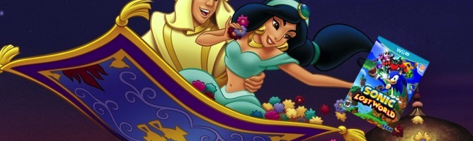
I really like the idea of bringing old and forgotten posts and such back up. Also, that Aladdin picture is VERY clever.
Keep on Running Sonic Stadium! 🙂
Fantastic job with the redesign, looks amazing!
I liked the old design better, but this design looks fine.
Also, how do we go about designing banners? I never saw anything about submissions when the user-made ones started popping up.
Yay! It looks so much better in Widescreen!
(Also I’m happy to see those funky old MS Paint banners go!)
Can I help make new banners? Pwease!!!!
Uh… I can’t see the link to the forums anywhere…
Click either “Community”, or click ‘Forums’ on the ‘Community’ drop down.
Gotta admit, Usually I find any site updates hard to get used to, but who knows, I might get used to this one.
Gonna Miss the Old Fan-Made Banners though.
Try using firefox and turning on the bookmark menu (ctrl+B). Some width issues there…
Sorry, I’m a software engineer and currently at work…
Took me by surprise at first but I actually really dig the new look for it’s clean style. I like the idea of news and articles staying around for a while so certain issues aren’t neglected within 5 minutes for the latest game update. The new site design also goes with my widescreen display 🙂
So does this mean new banners? If so where should I submit?
TSS didn’t really need the revamp…I mean, the last one was super fast and really good looking too!
TSSZ however….
I hate it! 😀
Hm… interesting change. 🙂 I hope it works.
Lazy port of a great site, slightly broken widescreen, doesn’t play as good it used to, 6/10, original was better.
Jokes aside, the site looks good! Also, I’ll give a GMod/SFM banner a shot tomorrow, is there a place to submit them?(Will I find it on the forum tomorrow because I haven’t bothered to look now? My guess is probably…)
This is an interesting look – I do agree that previous articles should not be pushed off by a flood of new information.
That being said, I DO find the wideness in Chrome to be a bit too much, especially with all the empty space on the right once you get past the Twitter feed and ad (ironically the one I’m seeing is about depression. Something tells me most Sonic fans have felt this at one point or another! XD). However, that is the only complaint I have.
Keep up the good work~
It looks good, Dreadknux. I like the layout very much. TSS has always looked good over the years.
This is Blast Processing, then, more or less TSS style. It is just keeps getting better and better here as the years go by. Old dog, new trick, but done right as always!