Early last year, the world saw the first trailer for the Sonic the Hedgehog movie and we got our first look at what the blue blur would finally look like on the silver screen. To say that fans, non-fans, and society in general had a very negative reaction to what was shown onscreen would be a gross understatement. From his small eyes, his wide head, pasty-white hands with clawed fingers and human-like proportions, Sonic looked hideous. Practically a monster.

But recently, Paramount has been looking closer at feedback for their movies and taking action accordingly. The prequel/reboot “Bumblebee” is a good example, as the Transformers look much more like their old “Generation One” selves rather than a bunch of jagged scrap metal made into human form. With pretty much the entire world agreeing that the first Sonic design was a monstrosity, Paramount delayed the film by over three months and went back to the drawing board. They then brought in Sonic artist Tyson Hesse (along with some very talented CGI animators) to help fix Sonic and make him look more appealing.

Many months later, a brand new trailer was released and the new Sonic design was shown to the public. While the content of the trailer may not have won everyone over, the overall consensus was that Sonic looks much, much better. In fact, in my own humble opinion, I think this may be one of the best, if not the best design Sonic has ever had! Even better than the games. He went from some ugly, nightmare thing, to a cute, little rascal.
The Body Proportions
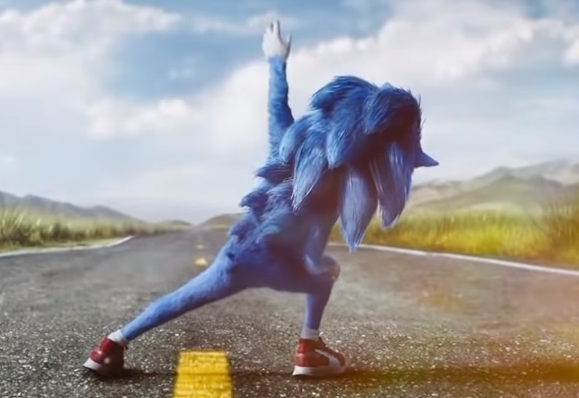
The difference in proportions between the newly-designed Sonic and the old one is similar to that between Classic Sonic’s design to Modern Sonic in the games. Despite basically being the same size, the old Sonic movie design had this “lean and lanky” look, with more human qualities such as long legs and arms, elbows and kneecaps. The new movie Sonic goes for his classic game look – short and a bit chubby with more cartoonish features. It’s a look that reminds me more of Mickey Mouse than a tiny human. He may not look like he belongs in the real world, but it’s a far more appealing shape.
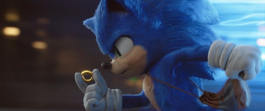
The Eyes
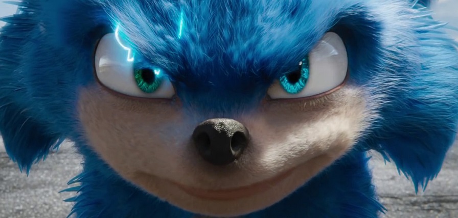
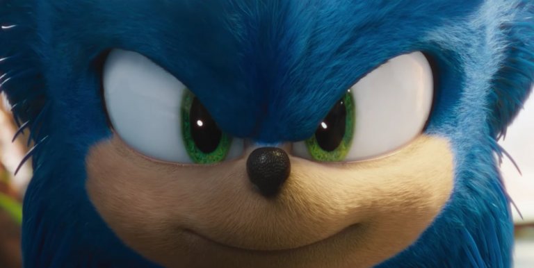
The first major improvement I noticed was Sonic’s eyes. Now, I totally understood why they made Sonic have two separate eyes vs. his uni-eye in the games. It just looks wrong in a more “real-life” scenario. However, the small and widely-separated eyes of the first design simply didn’t look quite right. What the redesign did was not only better than the original version, but better than even the game design.
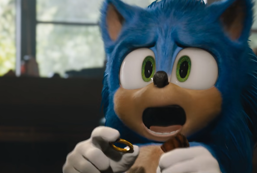
His eyes are now back to the big, wide shape they are in the games, but with the bonus of having a thin bit of flesh dividing them. But perhaps my favorite change is the large irises. They are much bigger than even his game counterpart’s, and what Sonic loses in “edginess” he gains in cuteness. One of the most important and appealing design features in any character is the eyes – they are the gateway to the soul, as they say. It makes some of the more cheesy jokes in the trailer forgivable because you just can’t help but love the charming, little scamp.

The Gloves
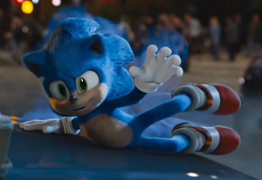
One of the creepiest parts of the old movie design was Sonic’s pale, white hands replacing his gloved ones. While I’m very happy they corrected that, they also fixed a problem that the game counterpart had. The hand size actually fits the glove now. If you look at Sonic’s game design, his skinny, noodle arms are disproportionate to the gloves he wears. His hands would have to be massive to require gloves of that size.

With the new design’s arms being proportionate to his hands, we get a Sonic whose gloves finally match his proper arm and hand size. Speaking of arms, I gotta say that I prefer the blue, fuzzy arms of movie Sonic over the flesh-colored, noodle arms of his game counterpart. I know the flesh tone was done so that you can see his arms better when he runs in 2D, but the furry, blue fits more naturally for a live-action movie. Plus, Sonic always kinda looked like he was wearing a tank top.
The Shoes

The early movie version of Sonic didn’t use his iconic shoes, but rather, just some red Nikes with no socks. No socks! Could you imagine how disgusting and full of stank those shoes would be after just one day of running in them? Not to mention those shoes being front and center to one of the worst promotional posters I’ve ever seen. Thankfully, Sonic’s new design brought his old, classic shoes back, socks included and they’ve never looked better. They’ve got this softness to them rather than looking plastic and shiny like the ones in the games. I hope they show the shoes scuffing up over time. It always bothered me how Sonic’s shoes always stayed perfect and shiny.
Overall

I love, love, LOVE Sonic’s new movie design. Those big eyes give him more personality and warmth to his character and in my humble opinion, he’s never looked better. While the movie may have the same script and dialogue as before, any lame jokes Sonic may give are more forgivable just by his charming new look alone. He’s gone from “abomination” to “loveable scamp”.
I went from being disgusted, to looking forward to the movie – and all it took was a new look for the title character. In the end, the movie might still have its problems. Maybe it’s still isn’t salvageable. Maybe it’s a lot of fun. Who knows? Maybe Sonic’s new design is just lipstick on a pig, but if so… that’s one adorable pig.
Yeah no sorry. If they keep that design and the movie s canon for future games, im leaving.
Goodbye then.
See ya.
I agree. Not a good thing for the franchise.
are you saying the original design or the reboot design because the original design makes a lot a lot and I mean a lot of sense that people don’t understand..
I’d take the new movie Sonic over modern sonic for a couple games – i hope it does well enough for sequels so we can see tails and metal sonic added.
If sequels are made with the new design I really wanna see other characters like Tails, Metal, Knuckles, maybe Amy, if important to the plot Shadow
No thanks. Its better than the orignal movie design, but its still one of the worst sonic designs when placed next to the rest. i mean jesus christ he still has blue arms.
Adorable pig, indeed. I must register my agreement with this opinion piece.
This is an awesome redesign for the film, but let’s keep the film as a separate entity.
After all, why fix what isn’t broken with the modern design. This is not only a compromise between the live-action Sonic that Fowler wanted and what Sonic actually IS, but proof that Sonic can work in a live-action universe. We know that the modern games have issues, but modern Sonic’s core design isn’t one of them.
I’ve seen the news Sonic movie trailer it was pretty awesome. There’s also a baby Sonic he looks exactly like the other one that he’s been redesigned.
I’d be okay with Modern Sonic undergoing a little bit of a re-design, only because it’s settled too comfortably into a crooked-mouthed, plastic-shoed, bulbous-fingered alien looking MF with almost zero personality in his expressions. And that’s more so the art-direction of the character… but he’s too soulless now.
And that doesn’t give Classic Sonic a free pass either. That fat, noodle-armed monster is just as vacant looking, and has all the charisma of a bag of gravel. Classic Sonic has overstayed his welcome, for me anyway.
Movie Sonic isn’t quite there for me, yet, but I think Sonic needs a more anime-style, just to make him more lively and energetic. Sonic CD’s animated intros (And even Tyson Hesse’s animations) had him pretty spot-on, and a modern take on that, with more expressions other than ” (ツ) d ” would be greatly appreciated.
Yeah if this design or even Ben became apart of the games then ill drop the series completely.
I like the new movie design but I wouldn’t like it if they scrapped the modern sonic design. The one eye thing and his big hands don’t really bother me as its not exactly supposed to be realistic. I mean there’s floating platforms in the games for crying out loud.
I think he looks better with blue arms but thats just my opinon
I don’t find the Movie redesign to be the best Sonic design ever but it is one of the better ones out there imo, and like with the Sonic Boom design, the blue arms are just a minor issue to me. If I could change it I probably would but its nothing I find worth making a fuss over.
This design is way better then the original movie design but in no way is it the best Sonic design ever, not even close.
I agree that this is Sonic’s best design. While I wouldn’t like him to take over the game’s look (especially with how much this fanbase despises change), I wouldn’t mind a movie tie-in game or two. Especially if the trilogy rumor pans out.
Sonic’s best 2D design was in the Sonic CD opening animation, and his best 3D design was in the Sonic Unleashed opening animation. Somehow since Sonic 4 they’ve managed to make that design stiffer and less expressive and I don’t get how.