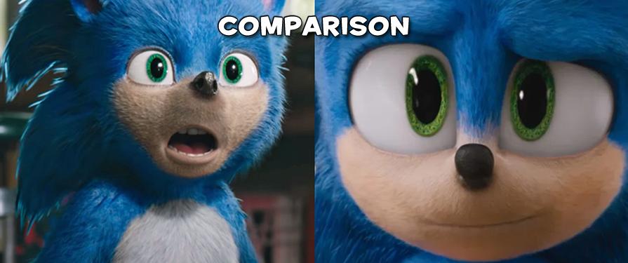
Earlier today, Paramount Pictures uploaded the latest trailer for the Sonic Movie, complete with a newly cut trailer and a redesigned hedgehog! We all remember how… unique the first one was, but this new trailer features a few of the same shots! Check out some comparison shots below.
What do you think? Marked improvement, or do you prefer the original? Let us know in the comments!


That’s my Sonic!
Yeah, in terms of the old design, his face seemed a little off. I wasn’t freaked out by it, just felt weird. I’m glad they fixed that with the new design. Plus, it just wouldn’t be Sonic without his gloves.