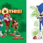
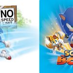
Style guides are odd little things, the idea behind them is to unify all items in a particular brand so that they are easily recognisable and that the brand is being accurately represented. What’s fun about them is that sometimes they have some odd little bits of information in them which is unknown, other times they have mock-ups of products which don’t actually exist, but could exist based on the mock up imagery in the books.
…And they’re not easy to get hold of, no really, they rarely pop up on ebay, the only way to get one is to buy a Sonic license… yeah.
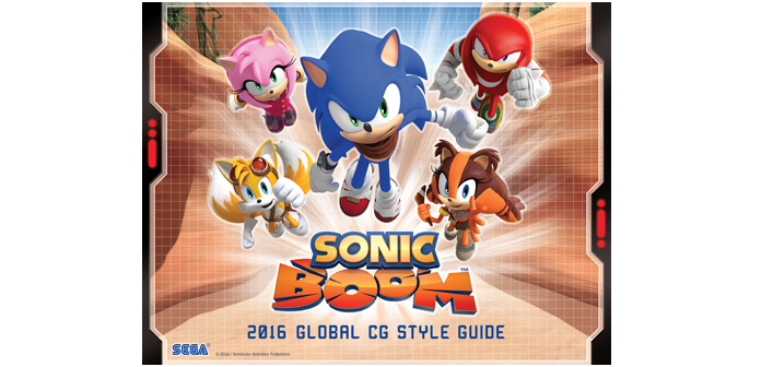
So you can imagine my surprise when the full Style Guide is up for viewing on the website which produced it, unfortunately, the images are not the largest so some of the text isn’t readable, but there are one or two interesting facts and notifications.

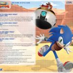
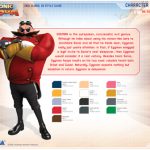
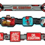
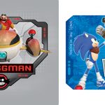
For instance, Eggman is apparently not all that interested in destroying Sonic, but he’s just after attention, “if Eggman snagged a legit invite to Sonic’s next sleepover, then Eggman would consider it a real victory”.
The full style guide is available in our gallery.
Source: http://www.designforceinc.com/sonic-boom-cg-style-guide


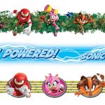

Such… cool renders!
Such small pictures! Ugh.
Agreed. Not even Michael Douglas can hambone his way outta this.
If anyone can answer my question I’d truly appreciate it, but there was an article awhile ago where you mention there was a style guide that had information for modern Sonic characters.
Does anyone know where that one can be found if it is available?
On another note this is cool!
Now this is neat!
I guess this means that Sega doesn’t plan on killing Boom anytime soon. Maybe.
Why would they, when the show’s been a hit so far?
You do realize that a second season was confirmed?
Wow I like Sonic Boom Style Guide doesn’t look bad is amazing well done is my favourite!
It doesn’t represent the franchise very accurately though. A bit too serious/energetic looking.
kill me.
I would, but I would have to charge.
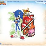
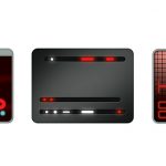
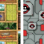
Not gonna lie: This is a very cool style sheet. The clash between the jungle themes and the high-tech windows reminds me a bit of Crash Bandicoot, particularly the later titles like Mind over Mutant. This is a good visual identity for the series and it fits Sonic well (kind of wish the would use something similar for the games).
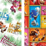
I really like this. I hope the second season of the show looks just as good as these pics.
*reads excerpt about Eggman*
Ugh, Boom Eggman is officially the WORST incarnation of the character. -___-
Please hurry with that anniversary game Sega…
And how pray tell will this imaginary game kiss your boo-boo and make it better?
they are skipping the anniversary this year.
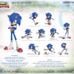
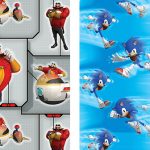
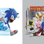
sonic boom poses is awesome but i can see his smash bros pose base on this. but sonic boom tv series wont last long i mean really why not season 3.
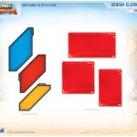
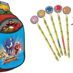
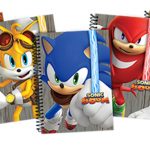
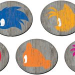
Can they make those notebooks with all 5 characters? I’d buy them in an instant!
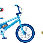
I believe they do. I think this is a preview?
I think its a collection of concepts and guidelines. Which means that while a lot of the stuff in this guide will be released, some of the stuff will be left on the cutting room floor or edited significantly for whatever reason. It would be weird not to have notebooks considering the target audience though, and I too would buy them.
And its still pretty cool to see early versions of upcoming merch.
It makes me laugh.
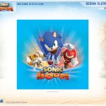
The cover represents the total opposite of Sonic Boom: Action, adventure and all those stuff that it isn’t!
It is a sitcom, where Sonic sleeps more than running.
How does the group dashing towards us represent that? Every single piece of character art of Sonic Boom has them in these kinds of poses.