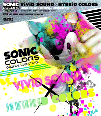
In addition to the release date of December 22nd this year, details have emerged that the Sonic Colors album “ViViD SOUND X HYBRiD COLOURS” album will be a 3CD affair (hence it commanding the price of ¥4200 – around £35 / $60) and will include a monsterous 82 tracks including pieces recorded with a live orchestra in Amsterdam.
Details can be found on the translated Game Watch Site. Thanks to Woun for the heads up!


im so downloading this
I’m sorry to say but that cover looks hideous.
That cover looks like puke
I coudn’t care less what the cover looks like.
I’ve heard enough of this soundtrack to know this is going in my collection.
Can’t stop listening to Planet Wisp.
The cover looks great.
Cover looks alright. After hearing Sweet Mountain’s music, I’m definitely going to buy this, ugly cover or not!
I’m not even complaining, I’m just saying that it looks ugly. It’s not like I’m over reacting about it.
But yeah, Sonic Colors music sounds great.
Wierd cover….
But seriously, I’m SOOOOO buying this! I LOVE Color’s music!
DO WANT.
Agh, right, Sonic CDs never get released here.
Haha, looks like the Wisps threw up all over the cover
The soundtrack is extremely catchy
The cover’s a stylistic choice — a far-reaching one, at that, but it’s growing on me! Kind of reminds me of the JP Sonic 1/2/3K covers, if I really wanted to stretch.
Cover is sweeet!
Loving the Album art.
So looking forward to this, from the stuff we’ve heard the soundtrack this time sounds really funky! Right up my street…
err why has sega got the sonic picture and put paint (i think wat the threw) and just put it as an cover but still i think its awsome and so looking forward to this and the game
That cover oozes of Manchester ’88. They’re coming a lill’ closer to it’s roots.
Ew… I hate the cover. It looks so messy. I’m sure that I’ll be getting this just for Planet Wisp’s awesome music though.
“Mika” springs to mind when I look at that cover.
Put this baby on iTunes Sega!!
That’s an awful CD cover…looks like a clown barfed on unicorn feces.
A full orchestra for special tracks? Sweeeeeeeeeeeeeeeeeeet!!!! Dunno if my ipod can take much more!
I cant wait for this album. And i love the cover. i dont see what people are talking about.
Wow I knew people would complain about this, but the cover art is awesome imo, it’s different than the stuff most artists use. It”s more likely to catch my eye which is prob why they chose such bizzare artwork.
Okay..get over the album art already, it’s not like it’s important or anything.
I can’t wait to hear this, it seems to contain an awful lot of variety.
Looks like Rainbow Bright puked all over the cover.
Anywayss I hope we dont have to wait THAT long (late december) to get some clean,crisp music tracks from the game, I’d imagine someone would start ripping the music the day it comes out or something
I’m guessing that the final boss will have orchestral music if this has tracks recorded by an orchestra.
BTW, look at the tags. go on, look. (lol)
(lol)
:HeroInferno ..Oh u
@ Hamilton and people saying not to give some negative on the cover
please, please grow up! I understand this is supposed to be a friendly community but to highlight ones opinion on a frankly awful cover is all fair game. It does matter actually because it’s the first thing you see before attempting to buy the product and this could impact sales and shows a clear lack of design sense.
Yes the music for Colours may seem appealing and it may well be great but a bit of crit on the art doesn’t hurt.
ps
Yes, I think it’s pretty bad but I’m not going to start ripping into others opinions. Debates are different than arguments.
@Hamilton
Hey, I’m not judging a book by it’s cover. D: I’m judging a cover by it’s cover! XD
I don’t know if my opinion is really the same as ProjectZuel’s, but I don’t think it’s too wrong for people to say they dislike the cover. They’re not complaining or anything they’re just saying they don’t like it. Big deal. I can see why the cover looks the way it does. It’s Sonic COLORS! lol I still don’t like it but it doesn’t bother me or make me dislike the music. ;3
@Hamilton: Get over it. We’re allowed to say that we don’t like the cover art if we want to. We’re not even bitching and making a huge deal about it. You’re the one who is being way too uptight about this whole thing.
The cover looks like unicorn vomit.
And I mean that in the best possible way.
Alright, if the music is the only thing that really matters then why does it upset you cause some people here said they don’t like the cover? I’ve already said that the music sounds great
@Hamilton
Seriously? Buddy, they’re just opinions. …oh, but WAIT….our opinions are not the same as yours, so that makes us wrong. Totally forgot that fat-headed rule. MY bad.
I was there was some Wisp art on the cover tho’
Guys, Ngamer magazine was released today. They reviewed Sonic Colours and gave it 86 out of 100, saying “Colours rockets Sonic closer to the stratospheric heights of past glories and hints at a great future. Welcome back, old friend. It’s been too long.”
Sounds like we have a winner here!
lol, Sonic jizzed colorz XD
Anyways, the soundtrack is awesome so far! The main theme is just catchy, but the level music is fantastic!
it’s…an interesting cover…not. I could probably do a whole lot better, I mean the typeface’s don’t match up at all and it looks like it’s trying to imitate clubland style posters with those splatter brushes and edgy design symbols etc…
However the music I am looking forward too, it sounds very promising from what i’ve heard already =)
I already love the music in this game, so I’ll probably buy it.
@Hamilton: You’re forgiving.
Don’t beat yourself up, maybe it’s the werehog in your icon talking
loving the cover
look so popart and similar to japanese megadrive sonic covers (like sonic 1 japanese cover)
http://www.sonicstadium.org/wp-content/uploads/2009/07/sonic1-jp-front.jpg
@ Hamilton
No, what I’m saying is is that this topic is surrounding the cover design; the music is a related but seperate issue. I do like the music but the cover is aesthetically unappealling and can affect sales and general viwer perception of the contents. I do like the music (bar the vocal stuff) but we should all be aware of appearances.
@BlueChaos: Well Werehog Sonic was so bad in Sonic Unleashed, the levels are so longer than loading screens in Sonic ’06. I wish Sega could get rid of Werehog stages in sequel to Sonic Unleashed.
NO MORE WEREHOGS!
@Ryan It’s called Sonic Colors.
When thinking about the title of the game, they could have went 2 ways with the cover, one bright and colorful in the kiddy way, or colorful but not pretty, The latter is a better choice imo.