
Level design has changed with Sonic’s ever-increasing emphasis on speed. Some people have enjoyed blowing through levels at 300-miles per hour, while others have disliked the new levels’ lack of actual platforming. Along the lines of last week’s Crossfire segment, this iteration presents the choice of whether or not the level design of Sonic games needed to change. Are the more linear designs of the Rush series or the upcoming Unleashed title make it stand out in the vast sea of 3D platformer games or are they hardly considered those at all and are labeled as cutscenes that we occasionally get to control?
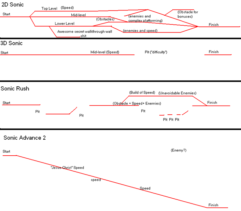
Before we start the point/counterpoint part, I present to you a diagram that a friend of mine showed to me a few weeks ago. It is so true that it is funny.

POINT: The level design of the modern titles is uninspired and only focuses on Sonic’s most marketable aspect, his speed.
Sonic is not about speed. I hate to break it to you, but he is not. Looking back, classic Sonic is nowhere near the speed that he is attaining today. His speed at that time was only relative to the speed of other platforming heroes of the 16-bit era. He gained that attribute by being faster than the competition, but still slow enough to where you could explore the twisted level designs. Earlier Sonic games had an emphasis on exploration, best illustrated by the time travel quest in Sonic CD and the hidden special stages in Sonic 3&K. There were always hidden surprises where you least expected it, whether it be a ledge floating out of your reach (leaving you to find transport up to said ledge) or some “awesome secret walk through wall shit.”
Sonic did not need concept art and other useless unlockables, because the level design and the core gameplay brought players back for more. Every level had extensive branching paths that would occasionally meet up in order to give players the freedom to go wherever they wanted to go. Replaying the game to check out a new path was always a great way to research the zone and find the best route to time attack it, something that people love to do to this day.
Levels were also designed around level specific gimmicks that made each zone unique and memorable in their own right. There were a few universal gimmicks, like springs and loops, but pinball flippers stayed in casinos and corkscrews remained in Emerald Hill. You saw these gimmicks in one zone and that was it, making each zone more memorable. I cannot even remember the names of any of the zones from Sonic Advance 2 on, because they all play the same. I only remember Music Plant from Advance 2, because it had those bouncing music notes and xylophones. It was the most interesting level of the game and therefore, I love it.
Sometimes, gimmicks are not the only thing that differentiates the zones in the same game and levels rely on their use of terrain. From zone to zone, each one presented a challenge that was different from the rest. For instance, Labyrinth Zone/Tidal Tempest both lack curved slopes and loops, using a more blocky, platform heavy level. Strategically placing those in-between zones featuring high speeds was a great way to break up any monotony. Although you might disagree with me citing the water levels, the ones that are usually the most hated, there is no denying that they are indeed different from the other zones in their respective games.
These older level designs are intricate levels that allowed the player to flow through without hassle, allowing them to either keep their speed up or ease the task of exploration.
COUNTERPOINT: The emphasis on speed was a necessity, an evolution that came with Sonic’s ever changing character.
There is not much I can say here that already is not illustrated by this point’s header. Some people, including me on occasion, find the blinding speed rather cathartic. It does not matter what zone it is or what is in it, I just want to “blast through with Sonic speed.” You cannot using the same design formula forever and the emphasis shift from exploration to speed was inevitable. Sonic Adventure established this “extreme” feel to the character and that new look and feel came with extreme speed. The level designs are the best speed sections of the classic zones and are satisfying just to tear through.
What does not change in the modern level design is the theming. Every game still maintains the time-honored tradition of the water level, the fire level, and the grass level, giving the player something fresh to look at every 2 acts. The thematic change is all the player needs to make the zone memorable.
I feel kind of disappointed that I failed to flesh this section out more, but I was just completely stumped. I even asked many people on AIM to voice their opinion on modern level design, only to find that they sided with the classic style. I hate leaving almost an entire point to the community, but it is up to you to fill in any blanks. Help me out here, please.
Check SSMB for the corresponding thread today!
The Crossfire is a weekly debate column by Slingerland at The Sonic Stadium.


While I find this article interesting, I would have to disagree. Sonic is about platforming, but the core of sonics fun is in the blinding speed. The genesis classics were fast for back then, but it only makes sense for modern sonic to grow, and progress onto the next level of speed! Sonic can run at the speed of sound, and thats pretty damn fast, and thats the way I like it.