We’ve talked a lot in the past about the development of Sonic Boom, since its release, former employees of Big Red Button have posted tons of early development material regarding it’s development which indicate it was once a much larger and very different game.

One such piece of evidence was a photograph taken inside Big Red Button showing what appeared to be an old logo for the game, however the name wasn’t quite clear and since then nobody has confirmed the name.
However, we now know what it is. Sonic Synergy was the original title for Sonic Boom, both the Wii U and 3DS version.
According to a website for Edward Moore who was a UX/UI design consultant for Sonic Boom, Boom was once entitled Sonic Synergy.
He describes his input on Boom as
High level User Experience & UI Design, Flash/Actionscript implementation for the majority of HUD elements, and Localization Production and Debugging.
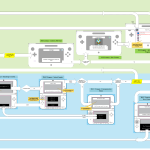
Along with this are two UI diagrams for both the Wii U and 3DS version of Boom, these diagrams both contain the original Sonic Synergy title screen, as well as other early concept artwork for the game.
In addition to this, there’s evidence to suggest that Boom Sonic looked a lot different.

Sonic’s arms are back to being tan in colour, spikes are also different, much more like the Sega Sonic version. Amy also has some differences too.
What do you think? Sonic Synergy? Good title? Bad title? And Sonic’s alternative design? Like it, Hate it? Let us know in the comments.
To see the full sized images UI designs, check out the gallery below.
Source: Coroflot
The Sonic Stadium may link to retailers and earn a small commission on purchases made from users who click those links. These links will only appear in articles related to the product, in an unobtrusive manner, and do not influence our editorial decisions in any way.


