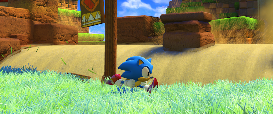
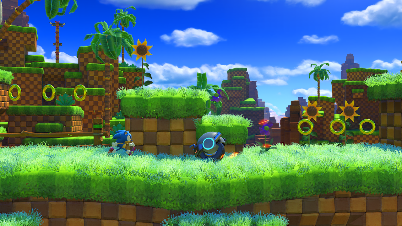
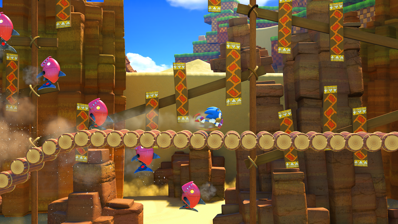
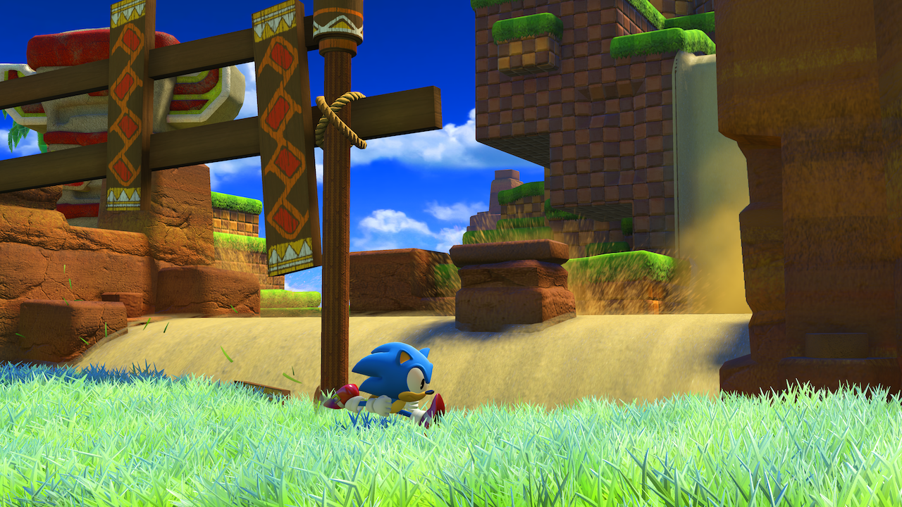
A video showing Classic Sonic playing through Green Hill Zone has been uploaded today. Much longer than the snippet seen in the Nintendo Direct, it follows Classic Sonic as he traverses the entirety of the zone, presumably the first one Classic Sonic will go through in the game. Get the video below and screenshots;
Interesting things to point out about the zone include the unusually high amount of sand everywhere (including some pyramids off in the distance at the start), Motobugs with different colour palettes to usual and some Egg Pawn-like robots with striking similarities with the giant robots we’ve seen before. How does this all tie into the story? Who knows at this point, but it’s sure to be become clear in due time.
Source: SEGA Europe (Youtube)


It also appears that the drop dash is in this game. Watch around 1:22. Wonder if this game has any ties to Mania?
Good eye!!
Why do the graphics look so bland? They look on the same level as Generations, which is last gen. Did they even bother upgrading them?
Scratch that. It looks WORSE than Generations. Green Hill looked more detailed and pleasant to the eye in Generations:
https://i.ytimg.com/vi/4JWCcIq9nrg/maxresdefault.jpg
http://gematsu.com/wp-content/uploads/2011/04/Sonic-Generations-Meristation.jpg
Worse* that Generations
Than*********??
If tho They haven’t finish making it yet i think it looks amazing even better than generations
These assets are mostly new, actually. They COULD of reused literally EVERY Generations Green Hill asset, but no. Mostly new ones.
Because Switch.
They’ve clearly said they’re going for a style a bit between that of Generations and Lost World. It’s not as super detailed as Generations, but it’s not as over-simplified and stylized as Lost World. It’s somewhere in-between, and kind of an awkward style to have in the modern day if you ask me, it probably would have suited Lost World much better if you ask me.
*redundancy is redundant, as I have clearly shown by saying “if you ask me” twice in the same sentence, lol*
That’s how alot of 8th gen graphics are I don’t care about graphics when it comes to Video Games I just want to play them
Is this beta footage? I hope so. The level design looks bland, the graphics aren’t that great IMO, and Sega is capable of much better retro music. Still waiting for Sega to release some Sonic Forces footage that really catches my attention, but right now nothing is really that notable.
Might be late to the party but didn’t Iizuka say “not Generations 2”, and “New experience!” at the anniversary party? If it looks the same and plays the same it might as well be Generations 2, with the exception that modern looks clunkier than usual.
Well technically it’s still in development plus what did you expect this was made by the guys who did colors and generations of course it would be similar
Just let me be disappointed at the new Sonic game in peace. I waited a long time for this, sadly.
The more i see the more and more disappointed I feel it seems like generations 1.5 at the moment. now that’s not a bad thing just not what i wanted from this game i do have to mention the music in that clip personally to me was terrible!.
Hm….maybe the sand replacing water is part of the plot…eggman is holding the world to random / taken it in an Oblivion style story as part of him “winning”
Also…that rotating jump….Sonic Cd classic sonic using time stones from little planet???
Would also link forces too……Sonic 4 ep2!!!
I have to say, as someone who was more willing to defend the whole Classic Sonic and Green Hill inclusion when the Direct teaser was shown, I’m a little bit disappointed with this. I mean, it doesn’t look terrible or anything, if anything the graphics look much better than the 10 seconds of footage the Direct had, the lighting really helps make up for the slightly simplified art style, and I think they may have added a few more textures everywhere, so it doesn’t look as flat as it once did.
That aside though, there doesn’t really seem to be much added to the Classic Sonic experience to really make it stand out from the Generations version (unless that really WAS a Drop Dash at 1:22, but you could still add a few more abilities like Super Peel Out and Spin Shield, but maybe as upgrades later in the game I guess.).
The stage layout also seems to be pretty by-the-numbers, like the first half is really trying super hard to follow the exact layout of the Genesis Green Hill Zone while the second half is supposed to be the “new” half but so far it feels like there wasn’t as much thought put into it. It doesn’t feel like it’s set up in a way to really wow or surprise anyone, apart from the deserty invasion in the background, but again that’s more chalked up to the graphics than the actual layout. Unless there’s supposed to be multiple acts for each character (and I really hope there is since they still seem set on making painfully short stages that can be cleared in 2 minutes or less), there’s not a whole lot to offer that would really excite the player.
That thing about the hidden spring placements that a few fans complained about is actually starting to bug me now, they really show up at places where you wouldn’t need them to, especially when a fully revealed spring would have worked just as fine. There aren’t too many boost pads placed in the stage thankfully (I counted like 2) but they are placed in such an odd way that it really does feel like you have no choice but to move in the “correct” direction. On that topic, I didn’t really notice any alternate routes or any subtle cues of one, so either they went out of their way to hide them from view or there is no alternate path and you basically have to reach the end in the one scripted path they have for you. And even then, there isn’t anything exciting scripted either, it’s just a mostly unchallenging run to the goal (which I also feel was placed too abruptly).
I mean I get it’s supposedly the first stage for Classic and everything and it shouldn’t be THAT advanced, but even Generations still gave some sense of challenge and dimension to the whole stage. No camera angle changes, no change between foreground and background, not even too many stage hazards beyond enemies, awkwardly placed spikes, and maybe one or two sections with a death fall (also what happened to the cute little warning signs with Classic Sonic on them, are we not getting warned of deadly drops anymore?), and just one zoom in from the camera. Other than that, it’s more like a Safe Hill Zone.
I’ve said before that I’d be fine with the stage’s inclusion if there was more of an effort to do something new with it, but so far nothing really feels new here, just “different”, and just barely too. I’m really hoping there is an Act 2 for this stage that has much more to offer creatively because even if it was designed much better, it’s still much too short to fully enjoy.
Also, a quick note on the music. While I don’t necessarily find it “bad”, it doesn’t really feel fitting for what is supposed to be Green Hill Zone’s return. It sounds more like a theme you would use for a power-up or a Classic Super Sonic or something, not as a full stage theme. I mean isn’t it a rule to have at least some part of Green Hill’s theme playing in whatever remix you have for Green Hill Zone? Even Windy Hill had a segment of Green Hill play in it’s theme, and it was still trying to claim it was it’s own thing! Now we literally have Green Hill and they don’t even feel like remixing the theme at all? What’s going on Ohtani? Again, it’s not a terrible theme, but it’s certainly not what I would use for a Green Hill Zone.
Ugh, why are there so many springs before every ledge and dash pads. I don’t want this.
Also the music is not great.
Then don’t buy it then.
Trust me….you want him to buy it. With the way Sonic has been trending, he needs every sale he can get.
This demo is not doing the game any favors outside of looking nice.
Oh my god, not… buy?
Wow, you have really opened my eyes with that comment. Until now I thought it was law to purchase every video game under penalty of death. Thank you for enlightening me.
No but seriously, whether or not I buy the game it still looks bad based on this trailer.
I personally like a lot of what I see here. This looks much better than what was shown in the Direct. The grass, trees, and flowers now move in the wind and the other animations seem smooth, it’ll no doubt get even better when the game releases. I also like how the stage didn’t have many setpeices and dashpanels. I’m very much excited to see more at E3.
Watching this alongside Mania Green Hill Zone footage makes Forces seem very underwhelming, there’s a whole lot more going on in the practically fan-made project than what’s going on in Sonic Team’s version of this level. There’s less enemies, platforming, and challenge all together in the Forces’ version of Green Hill compared to Mania’s version. All Sonic really does here is make a few jumps and hold right most of the time, and everything he does makes him lose momentum whether it be bouncing off an enemy or reaching the end of the S shaped caves. There looks to be no secret areas or branching paths in Forces’ Green Hill Zone, it’s more or less a quick game maker test level than anything. I understand Sonic Forces is still in development and level design can change within the blink of an eye (Windy Valley in Sonic Adventure had a completely different look until about a month before release date!) but them releasing footage of this level in this state does not make me excited for the game at all (especially since Sonic Mania is also in development and every piece of footage they’ve released looks great!). The only thing that interests me about Forces anymore is how Bubsy is going to play and what’s going on with the story.
My head hurts with how much I’m banging it with regards to Sonic Forces.
There is no Sonic cycle this time: either this game is going to be surprisingly good once it’s out or it’s going to be every bit the disappointment that I perceive it to be presently…and I won’t be coming back after if that’s the case.
Garbage. Absolute garbage.
Even the music is shit.
#FuckForces #BuyMania
Really Green Hill again…… Generations, Mania and now forces. I mean Green Hill is great and all ,but playing the level so many times, its kinda loosing its appeal.
However I am really looking forward to Mania and Forces. Shame Forces is getting bashed already.
I have no problem with Green Hill seeing Generations, Mania and Forces are Anniversary celebration games.
Forces is only getting bashed cause its clip they showed was quite bland and empty which is strange for a Sonic game.
hmm.. gaining momentum from such flat platforms is gonna quite a challenge
…Oh wait nevermind, we got an OP spindash and speed-boosters galore !!
be*
“gonna be quite”
Dear #SonicFORCES Dev Team.
– A good jump does NOT slowly rise into the air, and then fall straight down like a ton of bricks.
Rewatching this there are some musical similarities to splash hill zone. Hm.
Is this splash hill? Not green hill?
Exactly, and splash hill zone music was a variation of green hill zone music so i guess thats the connection lol
Having another green hill style zone is disappointing tho, we’ve already had more then enough games with that
The lack of camera dynamics are really killing the feeling of the level.
And is it me, or does Sonic abruptly lose momentum while he’s running in certain areas? Like it literally jolts, and then he’s at a slower gained speed.
Tbh as I’m excited about Classic Sonic being in this etc. But I feel the music was kinda weak which is strange. and the stage itself actually looks abit bland and empty….
I don’t know. maybe its true about that rumour I’m hearing, Sonic Team actually have no direction on where their going with this game.
It’s being marketed as a dark and gritty Sonic at war with Eggman but is still being all colourful and true to its roots but at the same time throwing in weird music etc.
Mania clearly knows what its direction is and what their doing with it.
I wonder if this gameplay is looking abit bland cause Mania is looking really good?
And once again, the stage can be beaten in under 2 minutes…
This isn’t doing it for me. Everyone’s played this stuff already, why do it again??
Can we just get rid of Classic Sonic already? Please? There’s a perfectly good Modern Sonic not being used to his potential.
While I’m still holding out before I get my final thoughts on this, I can get with what you’re saying. While the classic gameplay does have some fairly significant changes, we had the majority in generations six years ago, so the ‘why’ question rises up. I generally prefer modern Sonic in terms of design, since it reeks of this 90’s pseudo-anime style that meshes well as an upgrade from the original design. I also prefer his gameplay because it meshes well with his marketing which is based around speed, I’ve plugged 200 or so hours in generations improving my times on those stages and many more over the course of other games, so I get the appeal. I get the boost to win argument, yet I know people who play other platformers and games in general who struggle to get to grips with these kind of games, so the games do require a level of skill.
The whole thing with modern Sonic is that when he started out in 1998, he wasn’t as well received as the 1991 original. Where Mario 64 (1996) is hailed as a good transition from the 1985 original, Adventure as well as R, Fighters and 3D Blast were not as well received. That could be for anything from gameplay control or camera issues, overcrowding of characters, a change in aesthetics among many others, all of which are complaints about the series over the years. You notice a lot that people often prefer the originals in all types of media, which comes with the saying, “start as you mean to go on”.
Mario has been consistent relatively speaking for 30 years, where post 1994 Sonic had a host of changes, but people are used to how it started off so any significant change not keeping with what’s already been seen feels jarring.
The 19 years of modern Sonic we have had tell me that the guy has mountains of potential; the lore, the abilities, the aesthetic all work towards a brilliant character and they can be morphed into a multitude of areas but as you can see my friend, change is very difficult to get to grips with. I’m not saying the character or series is without flaws but still, who’s helping the developers and actually saying what’s good and what can be done better, cause I assure you, it’s not the vocal majority.
I’ll readily admit. I had to watch this a good few times before it clicked with me and even then, its not so much bad as underwhelming or unusual. I agree with the spring placement argument since it feels very off compared to previous series entries. The gameplay in and of itself is alright, if needing work in some areas, I.e I like how sonic feels more weighted here similar to the 1991 title where the bounce height from an enemy isn’t set but proportional to where you hit it and the spindash can still get you up to speed when you feel It’s necessary, as well as other features like the drop dash. The momentum may need some work but the animation seems to be well made overall and fairly tight.
I don’t mind green hill zone cause the stage itself isn’t what we see the most of in games as opposed to the aesthetic, which is that checkerboard/racing flag insignia we’re all used to by now. The design is a departure from generations more surreal approach which looks like an actual range of fantasy hills, rather building on the lost world aesthetic which was simplified for a change in direction,system limitations and other higher up decisions. I’d say that while I may have to get used to it, the improved lighting the hedgehog engine two provides does make it much more beautiful and almost unleashed like in comparison. I’ll hold out for new information since this could very well be a base aesthetic that changes later on the more we see of the game. Who knows, let the speculation wheels continue to turn.
I’m undecided on the music. I think the melody is very nice but the instrumentation feels off somewhat, it likely isn’t final though and the theme may be used for something else or it may just be placeholder for a different theme.
I’m actually reminded by all this of some of the early videos for Sonic The Hedgehog (2006), that showed off Kingdom Valley and Crisis City. I remember one clip using this awesome breakbeat with sirens and a lot of bass that didn’t make it into the final game as well as the beta version of kingdom valley’s track which had different drum samples and unfinished violins and crisis city with a focus on bass, drums and synths with the guitar parts missing and the whirlwind not implemented. I really liked the synthesized violins in that piece too.
I’m sure Mister Ohtani will pull himself up on this, Sonic runners version of sky road and Christmas theme of frozen factory are some of my favorite pieces from the guy in that rock style we’ve had since 1998.
Music is annoying, graphics looks outdated with washed out colors, Classic Sonic plays literally the same as last time, stage is way to short, its Green Hill Zone again.
Welp, I’m out.
I feel really sad about what I see in the gameplay.
I am a strong defender and lover of Classic Sonic, and when I watched the first trailer of Generations… that was true happiness.
But now, I am extremely disappointed: adding wind movement to the grass is the only improvement you can do, Sega? Seriously? Sonic physics are as poor and “unfluent” as in Generations: no momentum, neither by jumping or using springs, nor by running, entering into “tubes”, landing…
The music is really a step backwards in quality. It is extremely annoying and poor in the means used and the musical material: everything is completely synthesized, with disturbing drums, annoying melody, repetitive and uninspired. They clearly hired the same composer used for Sonic 4 instead of using the one that composed for Lost World, a game that has one of the most amazing Sonic soundtracks ever composed (which uses real instruments in most of the tracks). Even Tee Lopes would have been a cooler choice.
Easy then: I will only need to buy Mania if this doesn’t change… Pitty 🙁
Getting kind of nervous with this one. I want to like Forces, I really do, but man, this is kind of a turnoff. It’s not bad, it’s just… bland. I wasn’t even that big a fan of Classic Sonic in Generations, and while I’m excited for Mania, I’m definitely not too keen on Classic Sonic in Forces. IMO, they should have just kept it Modern Sonic and Bubsy/Fang/Antoine/Felix the Cat.
Looking at this footage closer, the camera functions closer to the originals. When Sonic jumps the camera stays at the same height off the ground and he moves higher in the frame, and when he lands on a platform that is higher or lower the camera snaps to a level that keeps sonic in the center of the frame like the classic games.
That’s pretty neat, the more I watch the more I see the minor details Sonic Team is putting into this and I’m more impressed.
I’ll be passing on this, honestly. Mania just looks so much like the better game. And they still haven’t returned to the classic physics based gameplay. It’s a coat of paint over Generations at best, with yet ANOTHER Green Hill zone…
I’m starting to feel everyone but the Mania team is simply out of touch. I hope the sales for Mania blow Forces out of the water.
I wish they made sonic colors 2 and i am not talking about lost world. This is disappointing. Pls no more classic sonic. This is obviously generations 2 as much as sonic team hates to admit it. Only good thing in this game would be the modern stages.
Eh, I haven’t been real hyped about this game ever since I saw Classic Sonic was in it. It was like, “Really, we’re gonna do another Sonic Generations?” Don’t get me wrong I like Generations; in fact, I consider it one of my favorite Sonic games. It’s just the Sonic verse has so many other characters they could focus on why not show them some love? Why not have some decent Tails or Knuckles gameplay for once?
Now seeing this… Man, it’s actually a bit painful. I feel they’ve fallen into uncanny valley with the background. And that music… Ugg. It seems WAY too generic. I pray the other level tunes and visuals are better otherwise Dark Brotherhood and Boom may have a new friend to hang with.