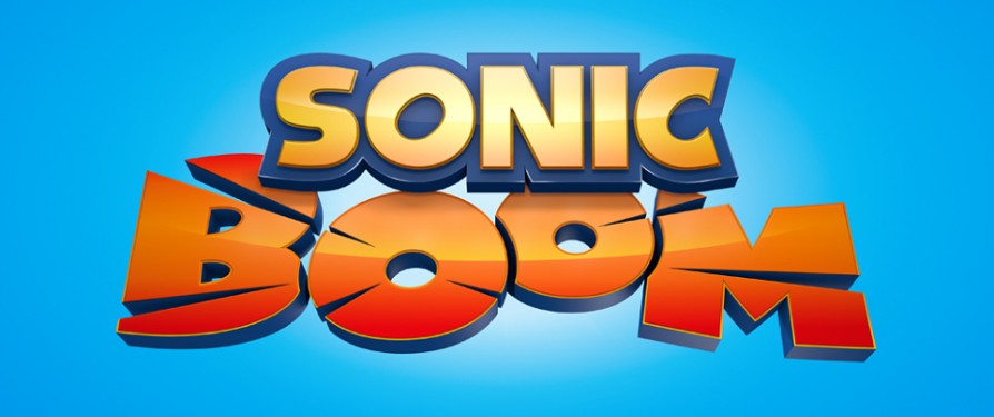
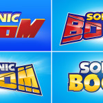
The Sonic Stadium has uncovered alternative designs for Sonic Boom’s logo that were scrapped in favour of the above final product we have now. The images were found on Senior Designer Henry Gray’s page at Creativepool where he describes Sonic Boom as “A grown up, adaptable and animated identity for the largest franchise from the Sonic stable to date”. You can check out the designs below.
Source: Creativepool
Do you think SEGA should have gone with one of the other logos, or do you like the one we have? Speak out in the comments!


I’d say Sega made the right call with the official logo.
I agree.
Yeah. These logos are a little too serious for something light-hearted.
Yeah, I think the current logo is a lot better. The other ones look incredibly cheap, which is the last thing Boom needed after RoL flopped.
lol
The ones with the small spikes on the Os give off a slight Sonic Heroes vibe to me, which is kinda fitting considering the heavy emphasis on teamwork in Boom.
Those aren’t spikes, look closer. Look at all the letters. It’s as if they’ve cut off part of the letter and badly glued it back on again.
I can only see that on one O on the red version. Compare the yellow one, then, to the Sonic Heroes logo and you’ll see what I mean.
These look more like Sonic & All-Stars Racing logos. A lot of them just look purely conceptual. For the bombastic comedy the TV show has to offer (and the somewhat more ancient setting than the main series), I think the current one is definitely the best.
well they do make nice logos for the game.
I’m not sure whether to be impressed by the logo designs or jelly because my graphic design is never as tight as that. I’ll just have to be content with being a pencil monkey 😛
Adding to the number that says that the current logo was the best choice for the show, but this also is just more evidence of such a directionless and corporate fueled clusterfuck SEGA’s productions always’ve been
In response to your second paragraph: How? Every major project has every part of it go through several design changes during the conceptual stage, both major and minor, no matter whether it’s a big, AAA production or a small, indie one.
But look at the way the font appears on those logos: Out of the 4 presented, only one of them looks remotely appropriate for an 11 minute kid’s comedy about Sonic. The others look like remnants of the original conception to make this an action/adventure series…IF That was the original intention and not just whatever “let’s appeal to DeviantArt sensitivities” decision was made by any of the artists.
Also, if these are the only 4 logos that have been lucky enough to past initial conceptual stages and NONE of them wound up up being the final, then it’s obvious how last minute the change in direction and how conflicting the views between BRB, Ouidoo and SEGA where about this project. Nobody on SEGA knew what the fuck they wanted to do with BooM outside of two principles: 1) Protect the brand 2) Make money. They’re lucky this entire venture didn’t sink into the ground thanks to the cartoon but knowing SEGA, they’re busy counting their eggs before they’re in the basket and they’ll find a way to fuck the cartoon up too (They probably already started with the forced intros of Metal and Shadow).
And be honest, unless it’s something like Yakuza or their arcade, SEGA has a propensity to rush projects and make stupid last minute decisions that show that they’re not capable of running anything beyond Japanese aracde type games. It’s time that SEGA follows in Squenix’s example and maybe aquire a western developer?
Or maybe they were going through many options and picked the best one. Like people do with any project.
But there doesn’t seem to be that many options. I think my assessment might change if I see more concept logos, but otherwise, this just reads to me as
“ACTION/ADVENTURE,ACTION/ADVENTURE,ACTION/ADVENTURE, ACTION…COMEDY? You know what? none of these are working, but that last part got me thinking – kids find cartoons more entertaining if it’s funny and we have a limited amount of budget to go around making fight scenes and set pieces. Make a NEW Logo, but make it loud and exciting, but not so serious, I’m gonna talk to the writters about 23rd re-write of the pilot.”
In short, it feels like SEGA had in mind one solid direction, and then did a 180 and began another direction. Who knows how many directions they took this project before arriving at the comedy we know and (some) love.
4? I may be wrong but I believe I see 9…
Either way, again, that’s all commonplace during the design and conceptual phase of projects. There’s usually three parts, the initial concepts where the cherry pick the best ones, then there’s the actual design and development phase where they pick the one they really feel is the best then the final product, complete with a final version of the one logo/design they picked. All major projects go through these processes, the fact they did the same here means nothing. I mean, Sonic himself went through multiple designs and concepts before they finally landed on the blue hedgehog we all know today, as did every character in Ratchet & Clank and Jak & Daxter, to name a couple outside examples.
Yeah, the current logo is much better. A lot of those felt like a challenge to read or make out. The current one is much simpler.
The blockier logos remind me of one of the alternate logos that was planned for Sonic X-Treme.