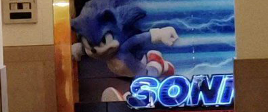
It’s happening, everyone! An eagle-eyed patron has captured a photo of the alleged redesign for the Sonic Movie out in the wild open!
Yep, there he is, staring at us from afar. Sonic the Hedgehog himself, and bonus, it really looks like him! It turns out that design we reported on last week was legitimate!
https://twitter.com/pablothinghouse/status/1188296985645854720
Between this and the rumors that a trailer is coming soon, it sounds like we’ll have a lot to look forward to regarding this movie! Once we find out more, we’ll post an update. Let us know what you think about the redesign in the comments below!


I see they fixed his shoes too.
They are still missing the skin colored arms.
Compared to the last version we got (as well as the casting, plot, and overall premise itself), this is an acceptable trade-off.
They weren’t gonna make it exactly like Sonic should look. It’s still gonna be as bad as Super Mario Bros. The Movie, Maybe even worse.
I think blue arms look quite good.
Maybe I’m just seeing things, is his tail white or is that just the background.
It could be that the image of Sonic (and his tail) is super glossy/reflective, and is reflecting the daylit floor and the glowing main SONIC title (which literally looks like it’s glowing).
Holy cow what a change he looks a lot better now!!!
Looking good!
Everything’s great but
BEIGE ARMS PLEAAZZZEE!!!
Beige arms on this update please