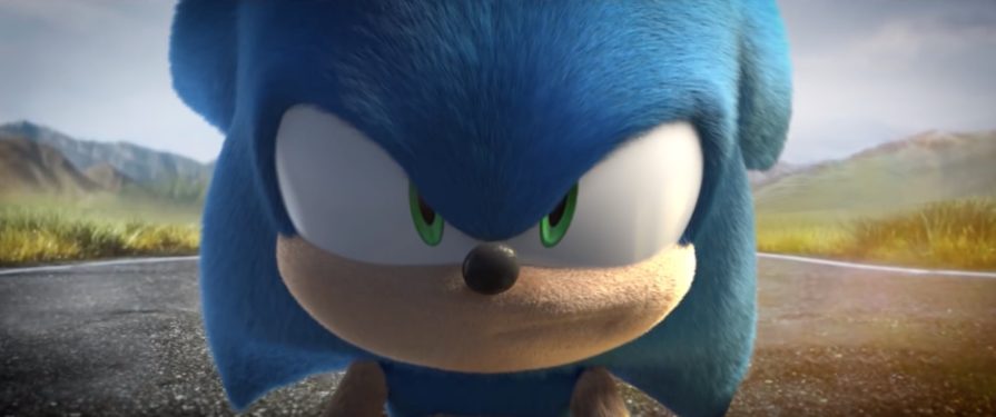
It’s hard not to feel a little sorry for the Paramount Studios team behind the Sonic movie. Since the original trailer was released a month ago, fans have gone out of their way to re-imagine the CG Sonic model in image form. But one Sonic fan has gone beyond – by redoing the entire trailer with an animated re-interpretation of the blue blur.
Animator Artur Baranov took it upon himself to ‘shop in a more cartoon-looking Sonic the Hedgehog into the original trailer.
He says, on his YouTube channel, that he’s aware “it’s a little rough”, but he “was trying to make it good enough before they actually remake him for their next trailer.”
We think, given the short time it’s taken for him to create this, that he’s done an amazing job.
Paramount Studios director Jeff Fowler recently announced that, following fan feedback on the design of the CG interpretation of Sonic, that the movie’s release date will be pushed back to February 2020 to allow for time to redesign the blue blur themselves.
We’re not sure if the studio will be looking at any fan-made re-interpretations as a steer for the official movie redesign, but it wouldn’t be so bad if Artur’s expressive model was used as a starting point.
Incredibly – and what is perhaps the point of Artur’s work here – watching the exact same trailer with the only change being a redesigned Sonic actually makes the trailer feel a little less goofy.
It’s a great re-invention of the movie trailer, and a great example of the sheer lengths that the Sonic fanbase will go to in order to contribute to their favourite game franchise. You can watch the trailer itself below – let us know what you think of Artur’s vision in the comments section below.
Via YouTube


A couple things I’ve taken away from seeing this trailer are thus:
Animation makes just as much (if not more) of a difference in believability as textures or detail. Sonic’s movement and lip syncing is definitely rough in this, and it works against itself more than the stranger choices of textures ever could.
With that in mind, this also reinforces how a lot of this can be forgiven if the character you’re looking at has a likeable design, and Sonic truly is exactly that. Even though it looks like a weird plush toy, it’s significantly nicer to look at than the furry’s dreamboat Sonic we actually got at first.
I hope this helps motivate Paramount’s VFX team to embrace Sonic’s cartoony origins. I understand that they may need to go a little wild with the quills and fur, but those huge, expressive eyes and bendy noodle limbs are non-negotiable. Sonic is a cartoon mascot first and foremost, not a funny animal caricature.
Like the article says, the creator realizes this is pretty rough but wanted to put out his proof-of-concept before the real trailer gets re-published.
Much better!!!! I can’t wait to see it now!! Yay!!
Vast improvement! He looks stylish and cool, like Sonic should. The eyes are maybe not 100% right, but this is on the right track. Good job Paramount!
It’s fan-made, which is obvious if you actually read the article:
“But one Sonic fan has gone beyond – by redoing the entire trailer with an animated re-interpretation of the blue blur.”
That is an incredibly huge improvement! Absolutely ace! Hopefully Paramount’s redesign will be just as good!
Maybe Paramount should hire this guy as a character designer on their CG animation team. It’s better to have actual fans working on large projects like these instead of non-fans who have no idea what they’re doing.
Bear in mind that FX team on the movie almost certainly didn’t actually design Sonic. Their job was to animate him and integrate him into the live action stuff. I’m definitely not a fan of Sonic’s movie design, but it’s not the FX’s teams fault he looks like that.
Um wow. This is just some dude doing this…. just some random dude, and it’s better than what Paramount did as an entire studio. Sure the animation is rough, but the character design in so much better and it’s overall waaaaaayyyyyy better than the original trailer. I smiled at not only Robotnik’s parts of the trailer, but also Sonic’s this time. I enjoyed the whole thing. Do it remotely even CLOSE to that Paramount, and you can have my money right now.
Now let’s not be jerks and crap all over this too, people. Again, it’s just some dude that this in barely any time at all. And it was great. I wish this man a thousand fellatios.
!!Yesss!! Finally This Is The Real Sonic The Hedgehog!! Now We’re Talking!!
Honestly that just looks bad. Had this been a movie not set in the real world and sonic a character zapped from a video game then ok maybe but seeing as its not and its meant to be a real world sonic being in our world tis just looks super odd
better than the original trailer