
We’ve talked a lot in the past about the development of Sonic Boom, since its release, former employees of Big Red Button have posted tons of early development material regarding it’s development which indicate it was once a much larger and very different game.

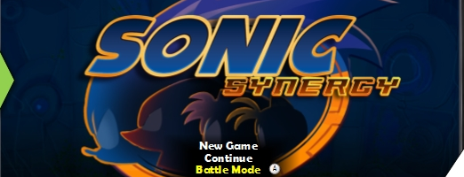
One such piece of evidence was a photograph taken inside Big Red Button showing what appeared to be an old logo for the game, however the name wasn’t quite clear and since then nobody has confirmed the name.
However, we now know what it is. Sonic Synergy was the original title for Sonic Boom, both the Wii U and 3DS version.
According to a website for Edward Moore who was a UX/UI design consultant for Sonic Boom, Boom was once entitled Sonic Synergy.
He describes his input on Boom as
High level User Experience & UI Design, Flash/Actionscript implementation for the majority of HUD elements, and Localization Production and Debugging.
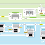
Along with this are two UI diagrams for both the Wii U and 3DS version of Boom, these diagrams both contain the original Sonic Synergy title screen, as well as other early concept artwork for the game.
In addition to this, there’s evidence to suggest that Boom Sonic looked a lot different.

Sonic’s arms are back to being tan in colour, spikes are also different, much more like the Sega Sonic version. Amy also has some differences too.
What do you think? Sonic Synergy? Good title? Bad title? And Sonic’s alternative design? Like it, Hate it? Let us know in the comments.
To see the full sized images UI designs, check out the gallery below.

Source: Coroflot
I like Boom Sonic’s original design a lot more.
When you mean original do you mean this one or the official sonic boom designs?
I think Synergy Sonic is better… though not sure on the arm colour, it’s the scarf, doesn’t quite go.
Yeah, I agree, it makes it look weird
Also I love the title Sonic Synergy more than Sonic Boom.
Agreed, the arms and spikes are a much welcome familiar addition to the newer bits like the the scarf and tape. Also, I kind of like Amy with the socks/cuffs. It seems like adding to these designs was a much better idea, I wonder why they settled on the current designs instead. Also, Synergy would have been a much better title, at least it’s more creative and unique on it’s own then Boom, which is something you would apply to ANYTHING Sonic related when nothing else comes to mind.
Oh wait, I think she’s always had those. I think the new bit is Amy’s scarf.
really?? tbh I think that this looks a little bit better
I have to admit Sonic looks badass in that last pic, too bad in the end we just got Boom.
I hate sonic in boom style ugh he has blue arms, toilet paper in his arms and legs and a irrelevant ugly brown thing in his neck!
I better like the synerecy! Sonic style is little better then the original boom one!
Sonic looks much better here than in the final. I’m curious why they changed the name and designs. The name is parallel to the gameplay beam mechanics. I wonder if this was being made before the TV show was considered.
…Weird…
When Sonic has tan arms and a scarf it looks weird, but when Sonic has blue arms and no scarf then it looks weird. I think Sonic should only have blue arms if he has a scarf on.
It’s odd but true. blue arms was actually a good choice.
…oh man, how the turn tables. X)”
I would say that I prefer the tan arms, but I’ve seen so much of Boom Sonic that I can’t imagine him without blue arms at this point. ^^;
“High level User Experience & UI Design, Flash/Actionscript implementation for the majority of HUD elements, and Localization Production and Debugging.”
That debugging part didn’t go very well did it?
Sonic Synergy sounds like a brand meeting that they’d have at Sega corporate.
That’s exactly it, they wanted a piece of the cartoon-toyline-game synergy pie. It most of been decided early on that the game designs weren’t toyetic enough to support a line similar to TMNT so they took the sports tape from the TMNT reboot ramped it up to 11 and had Crash Bandicoot’s character designer run with it.
I’m guessing they wanted something like a Skylanders style NFC toy model but were scared of the investment cost.
Why the did the sonic stadium changes its format when I read an article it looks dull
If you’re on mobile, the device is trying to decipher a more proper format to make it easier to find/read things. My phone has been switching back and forth for the past day or so.
The logo makes it look like a bad Sonic flash game
It’s clear that what became boom was the heavily rumoured reboot that got reported a lot a few years ago, with even this website reporting on Sega hiring for a remaining of one of their franchises. Boom was heavily in development and they had lots of ideas on the story and gameplay, and somewhere Sega stepped in and said they didn’t want to reboot anymore, and wanted to tie in with a cartoon, and to make this lovely beautiful game (we’ve ask seen the cryengine demo footage and the “bullshots”) a wii u game and they cut lots of content, and ideas, and creativity lost to deadlines and higher management decisions and that’s how we ended up with the mess that was RoL. I don’t have proof but it’s obvious
That first UI picture actually has an unlock-able Super Sonic in the bottom right.
Aww. Too bad, that Sonic Synergy title seems really cool. But at the same time, I’m glad, because maybe it can be used later for a main series game. I feel SO bad for how Sonic Boom: Rise of Lyric ended up. I’m not angry about it, just… sad. Though I still think Shattered Crystal is just fine.
I personally don’t care if Sonic’s arms are blue or not, but it’s interesting to see that originally, they were. The only critique I have in the arm department is that it’s weird how Amy, a hedgehog, gets peach-colored arms, while Sonic, also a hedgehog, gets blue arms. Is it something that comes with age, or maybe gender? In terms of spikes, I also don’t really care. Really, I have grown to like the redesigns as a whole.
Is it just me, or does that certain golden hedgehog in the UI design concepts imply that Chaos Emeralds were originally planned to somehow be involved in gameplay, collectibles, or etc.? I mean, that would’ve been “Super”, but besides Sonic’s “sub/Boom/Sega” design, I bet that the world of Sonic Synergy has some aspects that are similar or closer to Sega Sonic’s world. Otherwise, interesting find!
What they don’t show you is that before it was called “Sonic Synergy,” it was going to be called “Sonic Net Quarterly Earnings Report”
it’s good to see that, even at this early stage, the development team knew how important it was for every character to be wrapped in bandages like discount mummies
Seeing Sonic like he is in the picture really makes me think, god SEGA screwed up bad!
He looked a lot better, though I don’t see anything different about Amy correct me if I’m wrong!
Sonic Synergy could have been a lot better than Sonic Boom and I don’t think that’s saying much!
At least people couldn’t make sonic boomed jokes if they stuck with this name.
The Synergy is lacking! lol I humor myself! …… Oh who am I kidding that wasn’t funny at all!
What a cynical name haha, it’s just another term for a transmedia project.
I think the title ‘Sonic Boom’ was better, but I’m really digging this Synergy logo. The menu screen reminds me so much of the Sonic Adventure + Heroes series, which I find really cool, but perhaps that’s not good because then it looks old. Really awesome to uncover all this stuff about Boom though.
I think the synergy Sonic designs are better than the Sonic Boom designs used in the final version. And I want to ask why they altered it in the end.
Since SEGA want Sonic Boom to be a separate series they want to make Boom Sonic look a bit different from Modern Sonic so people could tell which Sonic is in which series. Seeing how Synergy is basically just Sonic with a scarf and sports tape there wouldn’t be that much of a difference and would probably cause a lot confusion amongst people and marketing.
Tan arms on Boom Sonic just looks wrong to me, I feel the blue arms compliment the other elements they incorporated into the Look.
Though must say the artwork itself is drawn very nicely.
…CAN I HAVE THAT? I mean, I like the cartoon, and the Boom Games, after playing both…..They aren’t even that bad. They ARE bad, but it’s not as bad as people say, it’s just bland as it gets. That said…This looks so much better, and the arm color would have saved Sega a bit of trouble. A bit. Barely. Sonic fans have been insatiable for years in many ways.
…Secretly, I like this design with the Blue Arms, they fit so much, but if it takes away ONE complaint, comments sections can be a bit less annoying. I want it to stay a comedy, no matter how many people hate it, I’ll let them keep up with their SatAM whining, read the comics, but..One less complaint.
Am I the only one that immediately had Sonic & Knuckles box cover come to mind when seeing that first logo?
Sonic Synergy doesn’t sound like a bad name. But It’s harder to pronounce than “Boom”, and considering the fact that they went with TV show as well, they wanted something that sounds extreme and catchy.
the title is not bad if i say so myself besides the title could have been like that before they name the world boom you know i don’t see whats the big deal about these titles next year they will show us a new character because some sonic birthdays 10 15 and 5 show us new characters yeah maybe it might be the monkey character or a female character :/
Just think, if they’d kept Sonic’s arms tan, Chris-Chan wouldn’t have re-rose to infamy.
We could have prevented this.
Then it would’ve been the scarf. Or the sports tape (“bandages”). Or the scruffier quills (if they went with that instead of this). He would’ve found a way. He’s insane, childish, spoilt but one thing he isn’t is stupid.
That early Sonic looks so much better.
Off topic,but anyone have a download for the new Sonic Runners update?
It’s really strange. On the one hand I think Sonic looks great with having his normal arms and spikes back with the rest of his Boom appearance, but at the same time I’ve grown so used to the current Boom appearance that I’ve got this two way conflict going on, and I think some other people on here are experiencing it too. “Sweet! He looks much better with his arms back to normal!” “Yeah, but now that I look at it, the arms don’t feel quite right when paired with the scarf, I think the blue arms worked a bit better.” It’s interesting to see just how easily some people who might have detested the idea of changing Sonic’s arm color can turn on the flip of a hat when offered the alternative, especially after being exposed to the change for as long as we have. Personally, the arms were never THAT big of a deal to me (truthfully I was spending more time freaking out over how “short” they made Eggman), but I have to admit it feels nice seeing him closer to his original appearance like everyone else…except Knuckles. And I think that’s what does it for me, it’s the fact that Sonic wasn’t the only one drastically redesigned, everybody got some changes, some more than others, but at least it made everybody look like they belonged together. I guess the concept of a Sonic closer resembling what we’re familiar and comfortable with kind of contrasts with the whole group unity that everybody’s new look gave each other. When Sonic tries to break out and look more like he does in his solo days, it kind of breaks up the team dynamic I guess. I’m not going into such detail with Amy, as her design amendment is barely noticeable and doesn’t disrupt the dynamic that much.
Whoa, loads of comments aren’t replies anymore, that’s confusing. Anyway, I always preferred the blue arms, to be honest. I never liked Sonics tan arms anyway, I always loved every part of his design except that. I always thought it looked like he was wearing a sleeveless onesy or something. lol
Also, Sonic 3 & Knuckles, anyone?