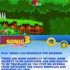
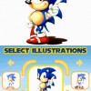
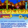
AAUK has provided TSS with the link to more Sonic Classic Collection images. This time, however, the images are not mocked onto a DS. You can see them in their full 2D glory.
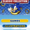
The bottom screen’s purpose is outlined much better in this batch of screenshots as well. It looks like it will be the home of saving/loading, pausing and a small description on each game. Check out our gallery below:
[via Sonic City Blognik]


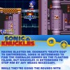

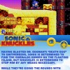


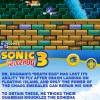



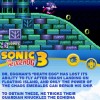


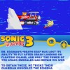

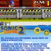


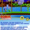

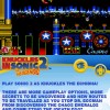


whats up with sonic in that flying battery pic (number 5)?? did they really add that or something??
Ack, yeah, this collection is definitely going to crp the edges of the screen.
“There are more gameplay options”
It says to you straight faced while cutting the vs. mode from the title screen, leaving only that now-ironic looking “1 Player” option.
Seriously?
^Leave the screens alone. They might not be the final results. Heck, even the main menu screen says (C) 2009 SEGA.
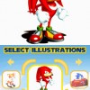
Boooooooooooooring!! They don’t seemed to have changed a damn thing and the concept art is from earlier collections.
Not getting this game 100%
Also, I can’t tell if they’ve altered the graphics or are just cutting off rows of pixels, but god it all looks cheaply squashed. If that’s the best solution to the DS screen res they could come up, then whoever they’re paying to do it has no imagination and just wasted a ridiculous amount of effort making the games look like ass.
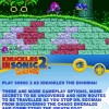
Why would they call it “Knuckles in Sonic the Hedgehog 3” when it clearly says on the title screen “Sonic 3 & Knuckles”? It boggles the mind. They even made a new logo for it.
@FlashTHD:
Unless they’ve actually added something new to Sonic 3&Knuckles, I’m pretty sure it means the new options/routes that were added in Sonic 3 & Knuckles that weren’t in Sonic the Hedgehog 3 and Sonic & Knuckles. I think.
@FlashTHD: Yeah, no artwork assets are being squashed or resized. This is being presented visually just as it did on Genesis, only the overall resolution is smaller. Genesis resolution is 320×244. DS resolution is 256×192. Accordingly the edges are being chopped off. Certain parts like the titles screens also have their assets moved closer together so that everything fits (notice that the main title screen images look HUGE in comparison to the rest of the screen).
This is a bit disappointing to me as well. I don’t think it looks bad, but not as well as I’d like, and I’m probably just going to emulate on a PSP to get my Sonic fix on the go.
And I lied a bit, I cropped a Sonic 3 screenshot myself to compare title screens. They actually smushed the title artwork a little bit vertically to get it to fit better.
Can see myself getting so much use out of this game its unbelievable. I may well actually wear out the buttons on my DS; It’s what I expected it to be. Mega Collection Lite. Nothing more, nothing less. The awesome concept simply is: Genesis games in my hand. (I don’t have a PSP, neither do I plan on getting one to even bother emulating) OMG hurry up March.
….wheres mah 2 player!?!
It’s not all they smashed, observe the Sonic 2 title. The lettering in the character select is inexplicably uneven (white text does not look the same as yellow), suggesting something else weird is being done to cram as much in as they can, or they’re just that lazy. The explanation better be just “lol old screens we sat on for months” cause this borders on embarrassing.
If these happened to be emulated (doubt it) and they could run a scaling filter something like this:
http://users.jonnys-place.com/FlashTHD/squeezetreatment3.png
Slightly blurry, but they’d be able to get everything onscreen and it’d probably look rather respectable. If the DS can’t do graphics filtering of this sort then ok, but then, why bother? Any other solution is not liable to look especially presentable with these limitations.
Definitely buying this game.
wait for the tss review (if there will be one)
The screen didn’t have to be squeeshed.
What the hell is Knuckles in sonic the hedgehog 3?